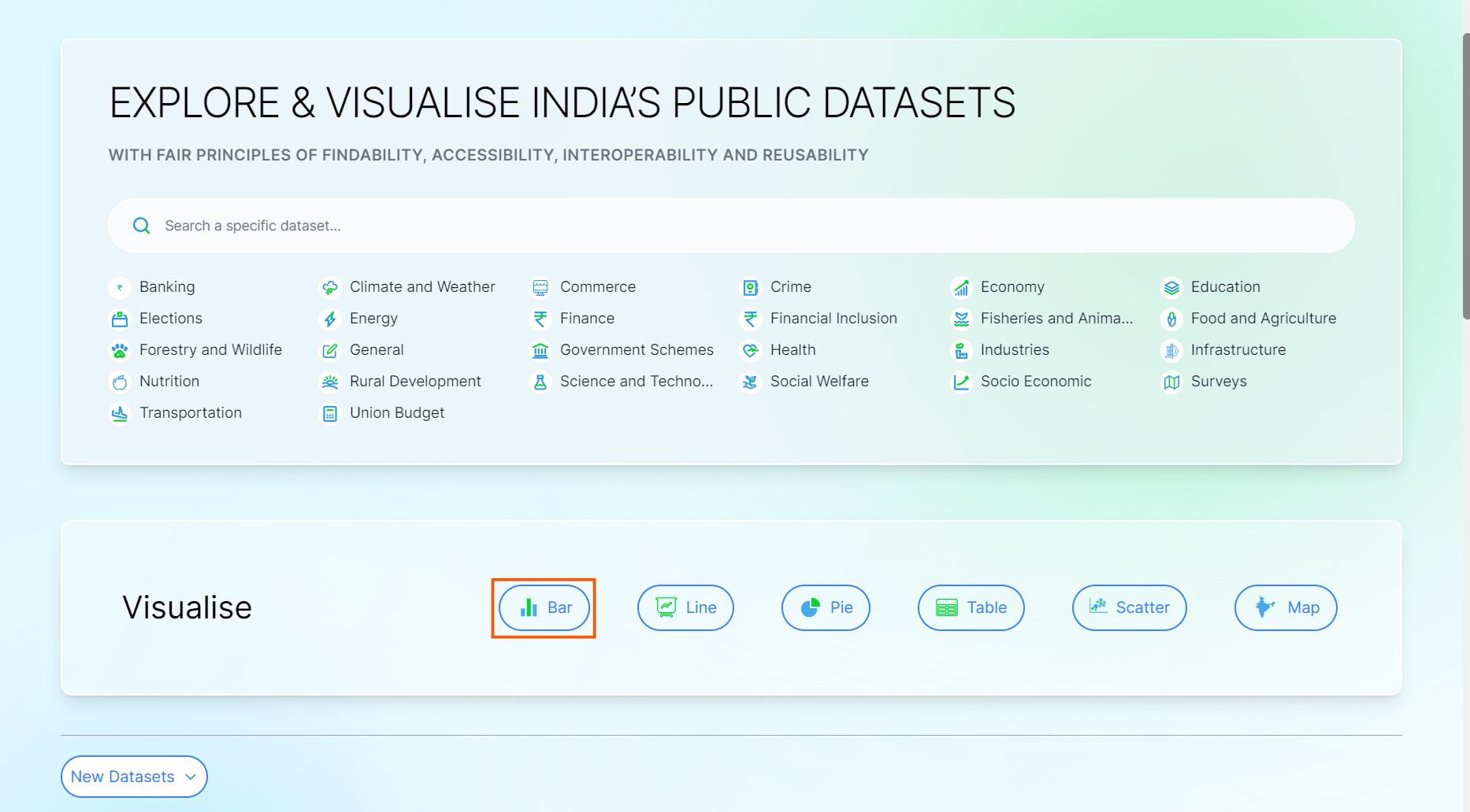
Ways to go on Visualise Page
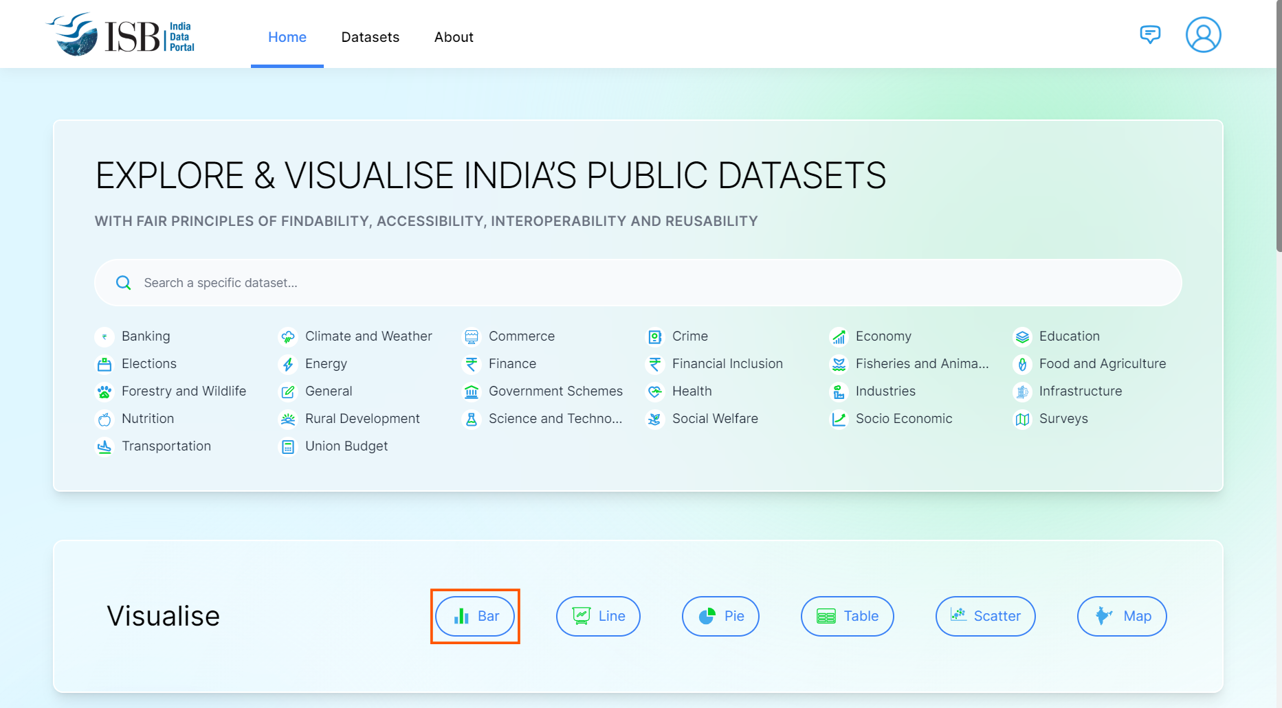
1. Click on any chart type in the “Visualise” section on the homepage.
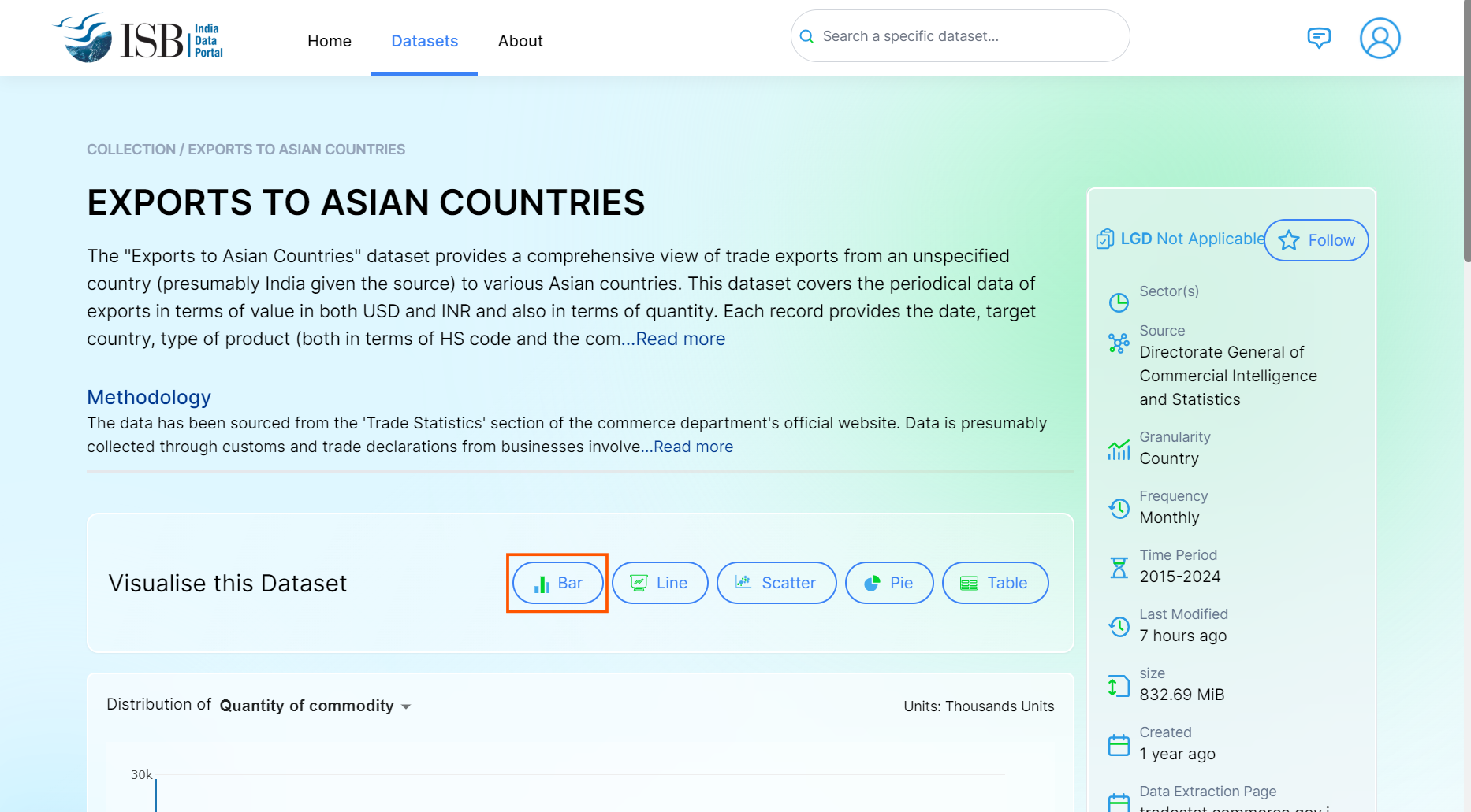
2. Click on any chart type in the “Visualise this Dataset” section on the dataset page to navigate to the Visualise page.
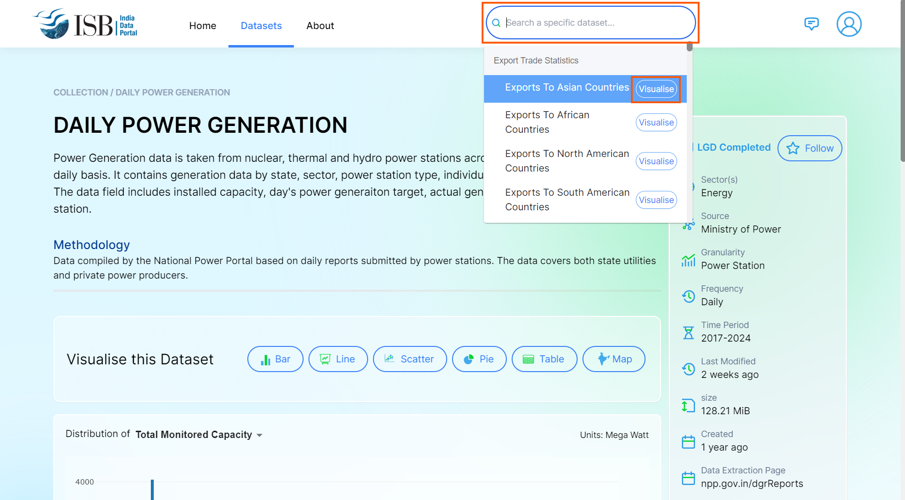
3. Click on the search bar in the header, browse or search for the dataset, and click the “Visualise” button next to it.
How to Build Visualisation
1. Click on any Chart type
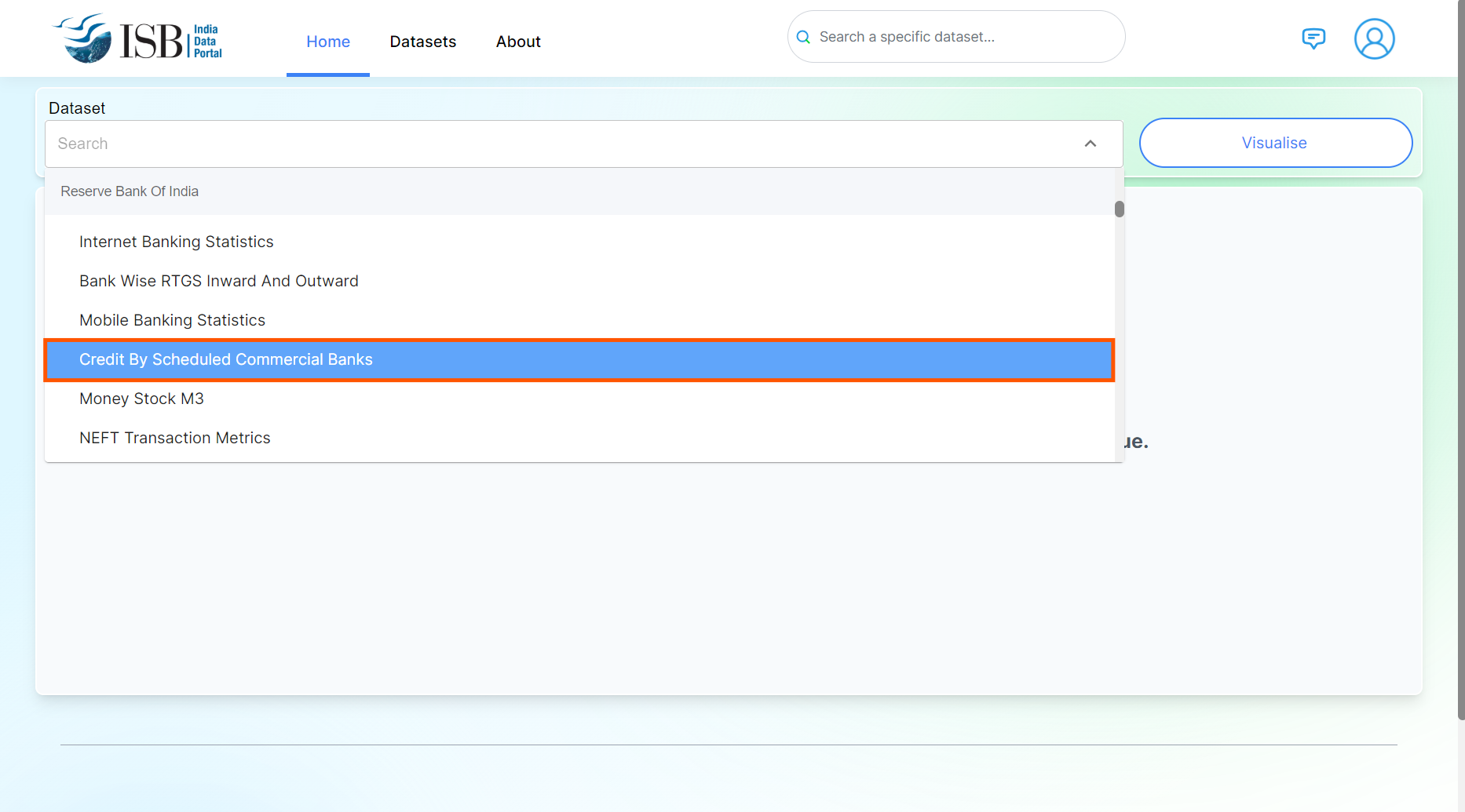
2. Click on toggle arrow to see the list of datasets you can visualise.
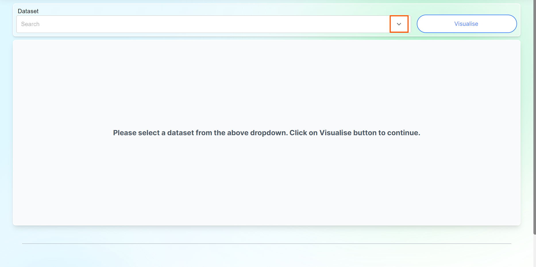
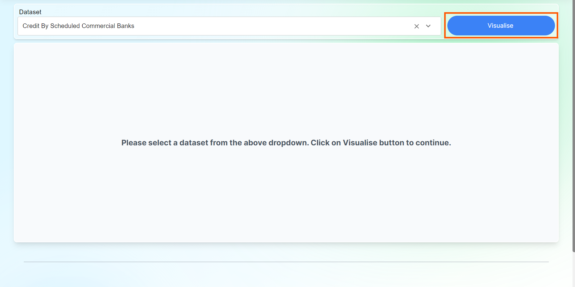
3. Select any one of the datasets you need to visualise.
4. Click on Visualise button
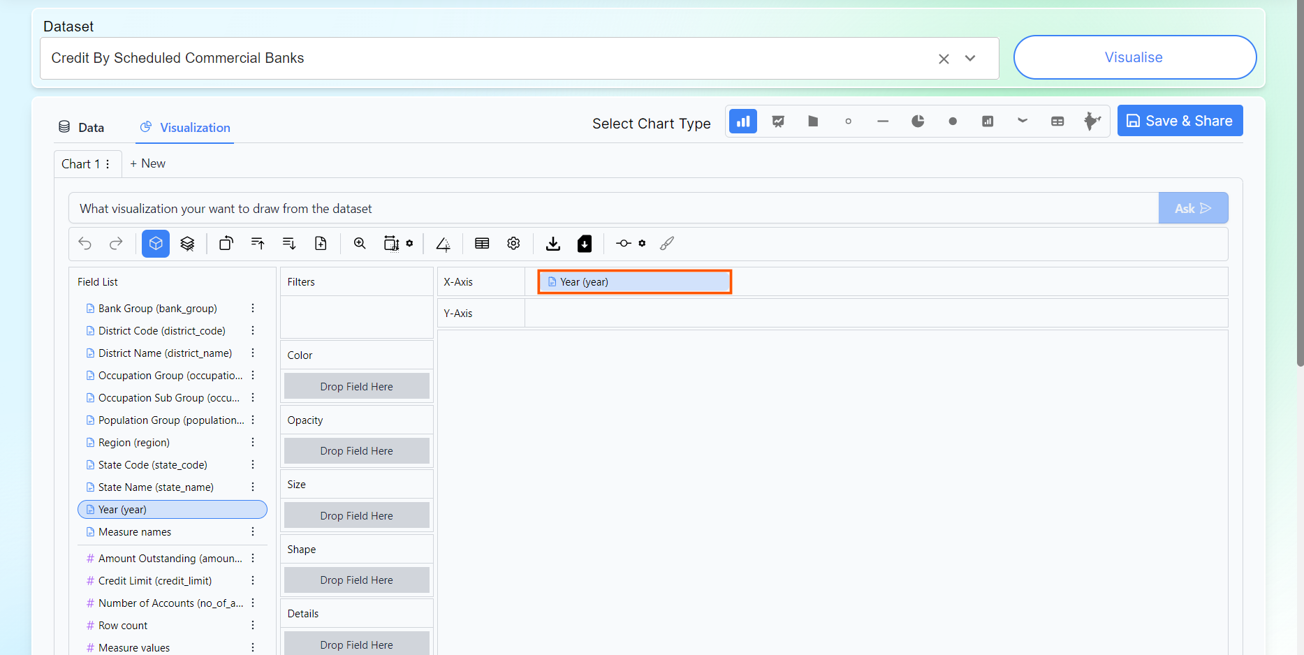
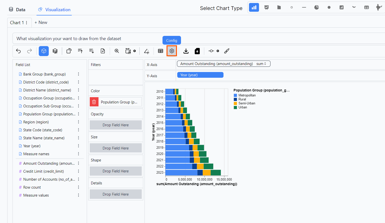
5. Drag and drop Categorical Indicator in X or Y axis.
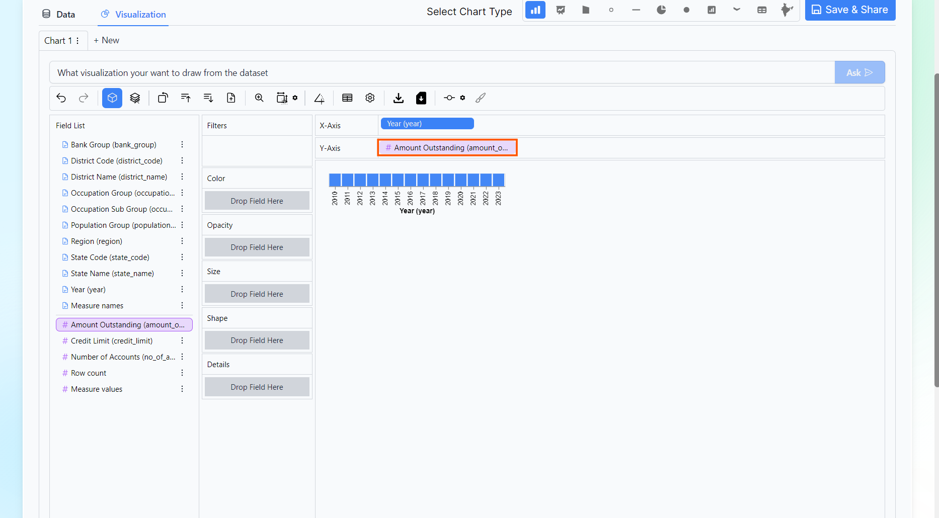
6. Drag and drop Numerical Indicator in X or Y axis.
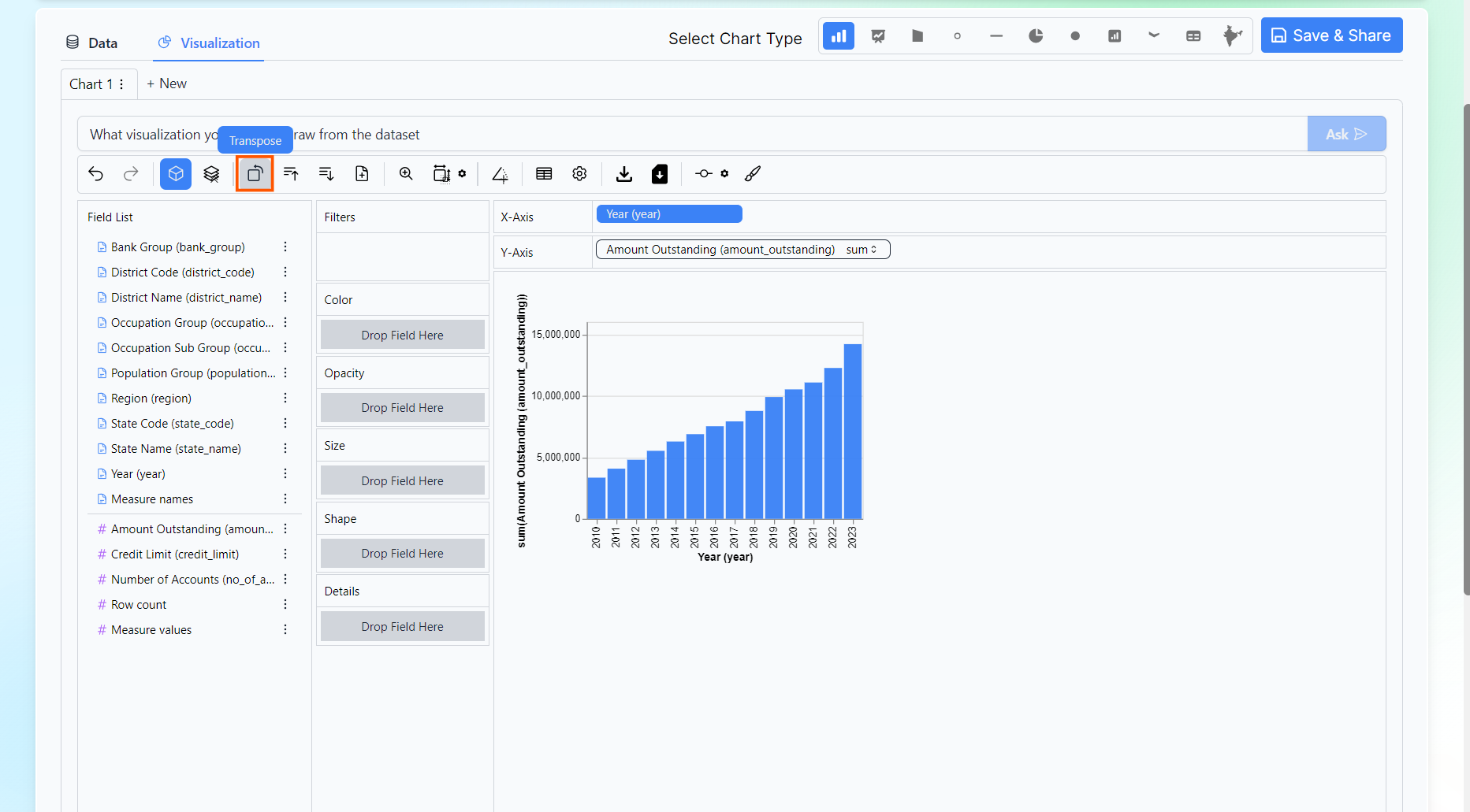
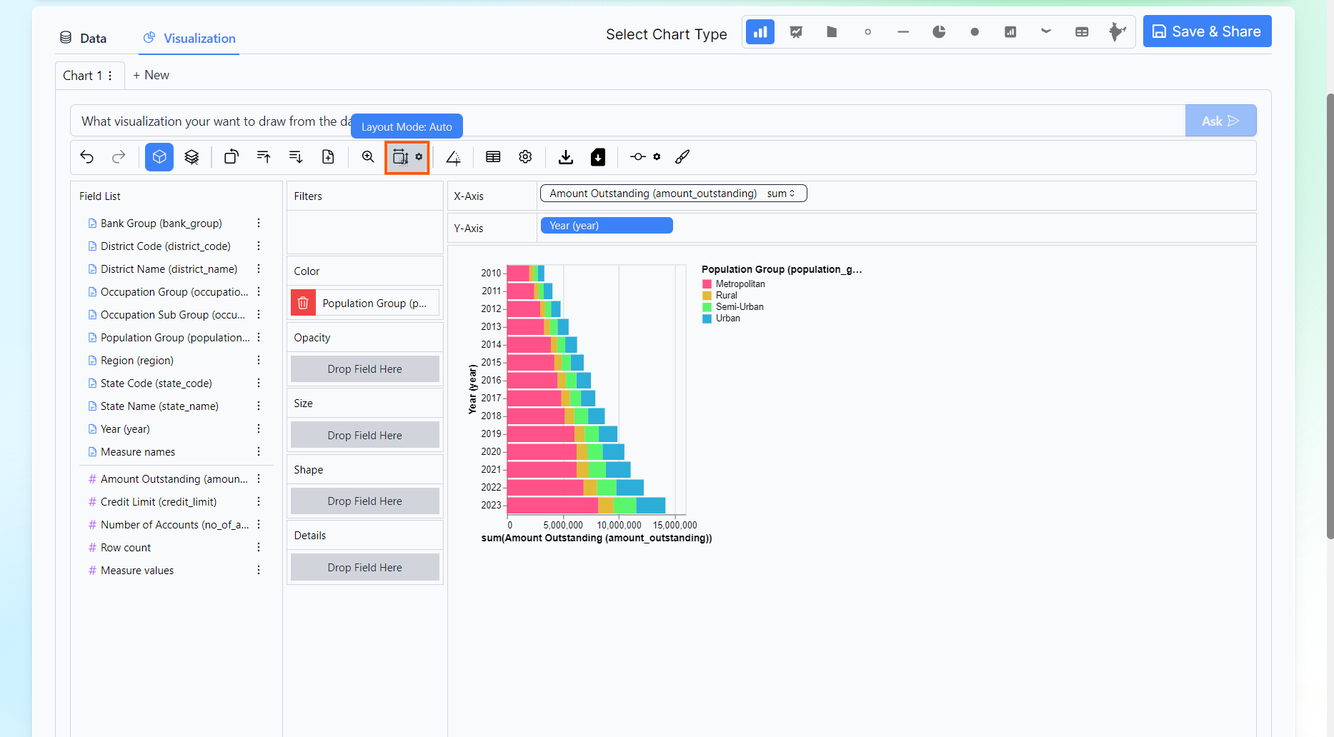
7. You can click on the options present in the tool Bar as required.
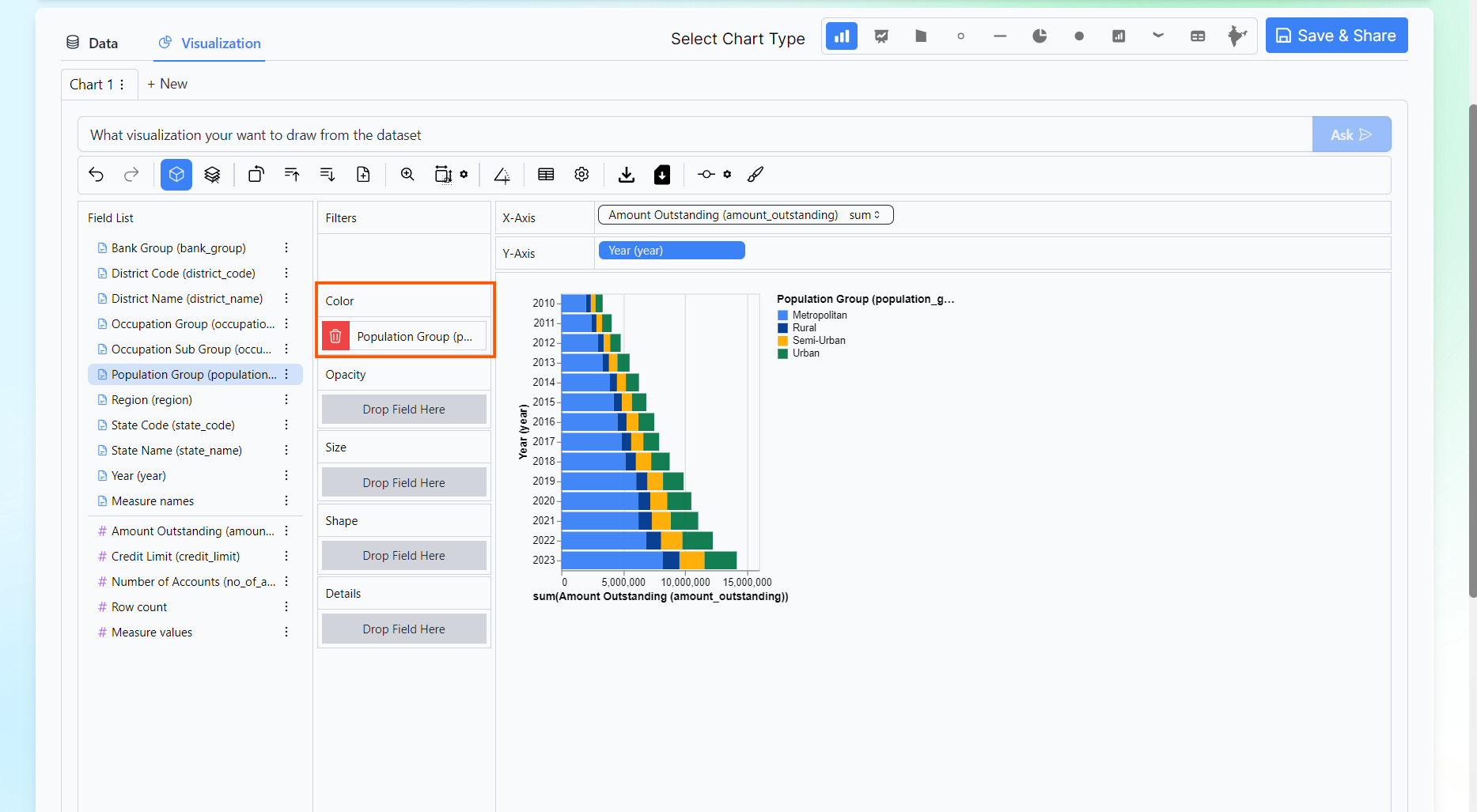
8. You can apply filters or drop any Categorical Indicator to see the difference.
9. You can use config option in tool bar to change the color of the chart.
10. A dialog box will appear.
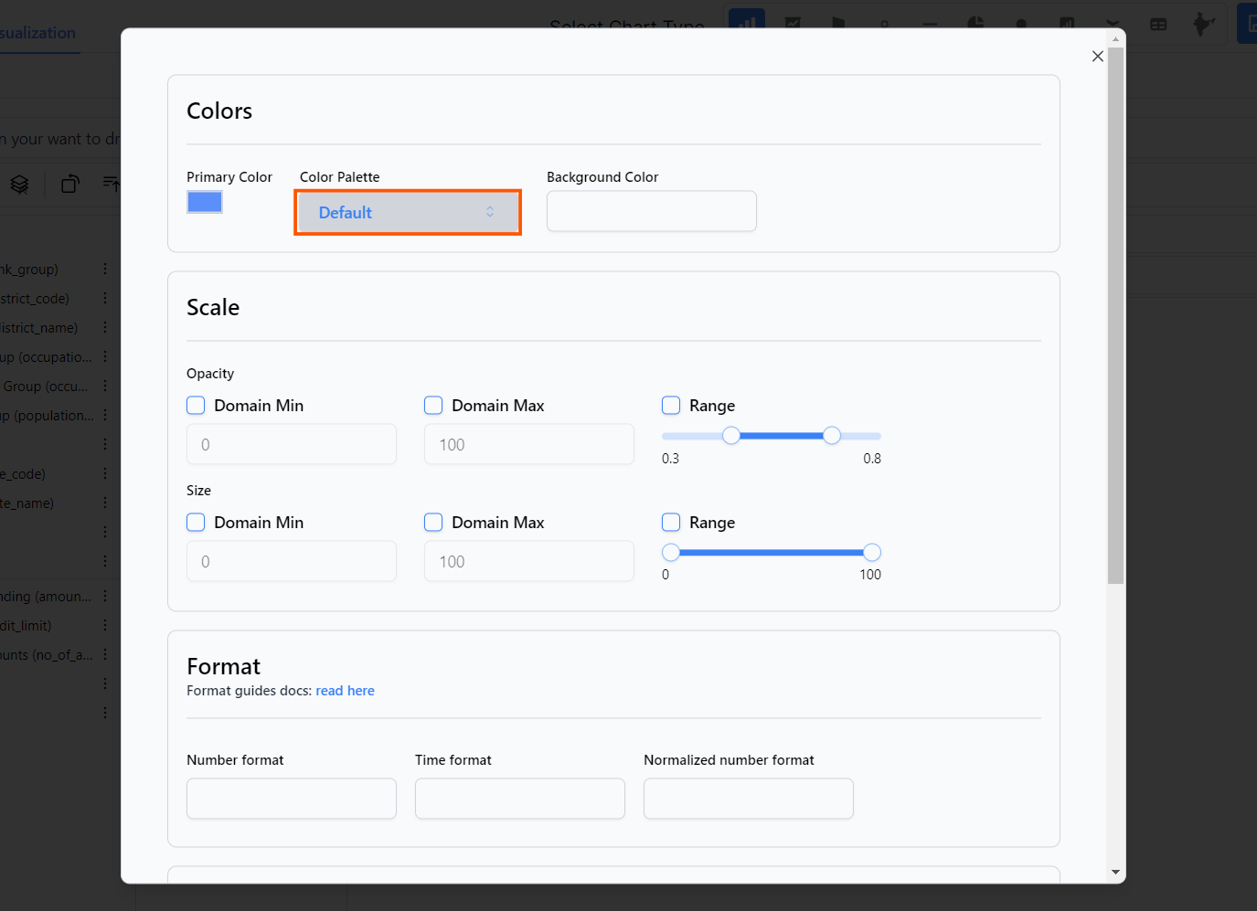
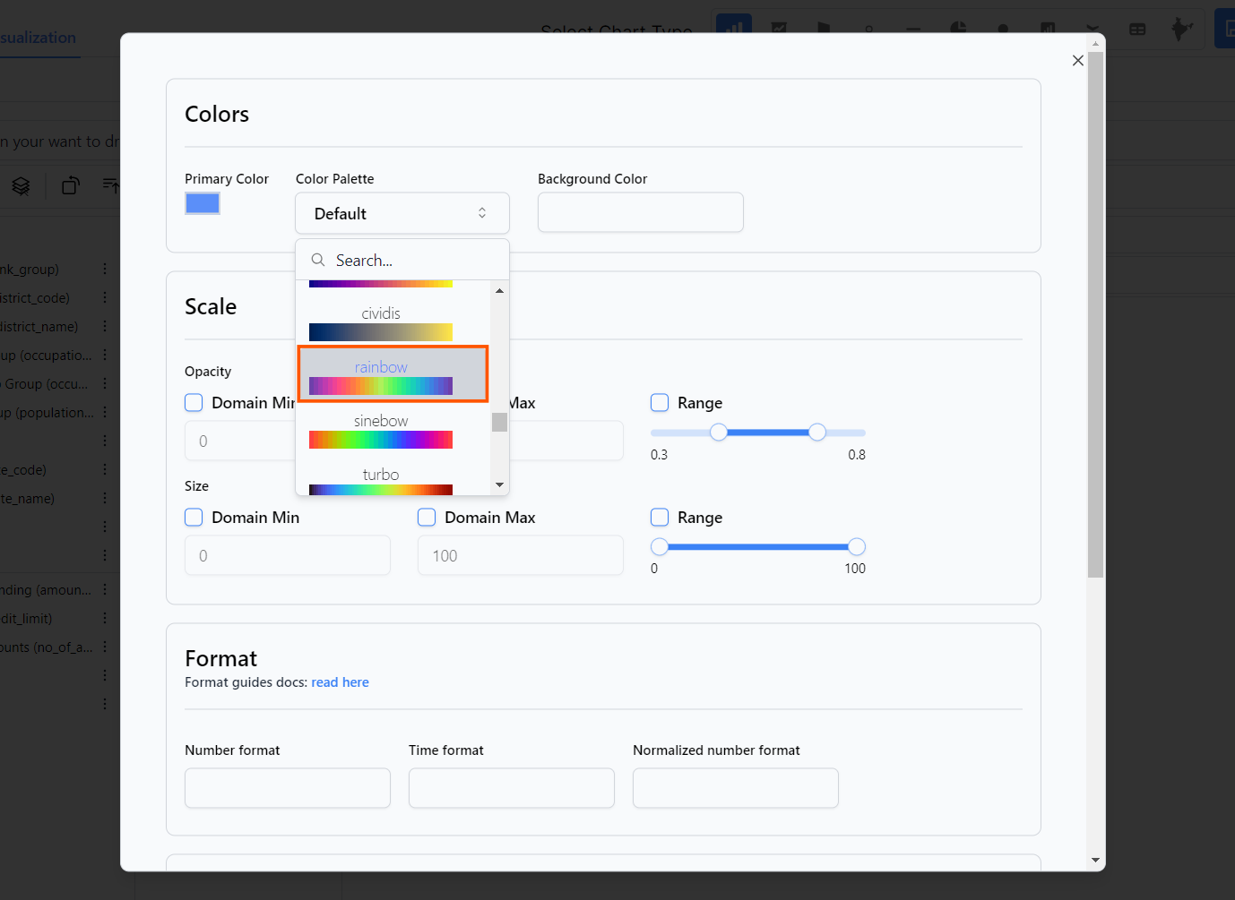
11. Select the desired color palette.
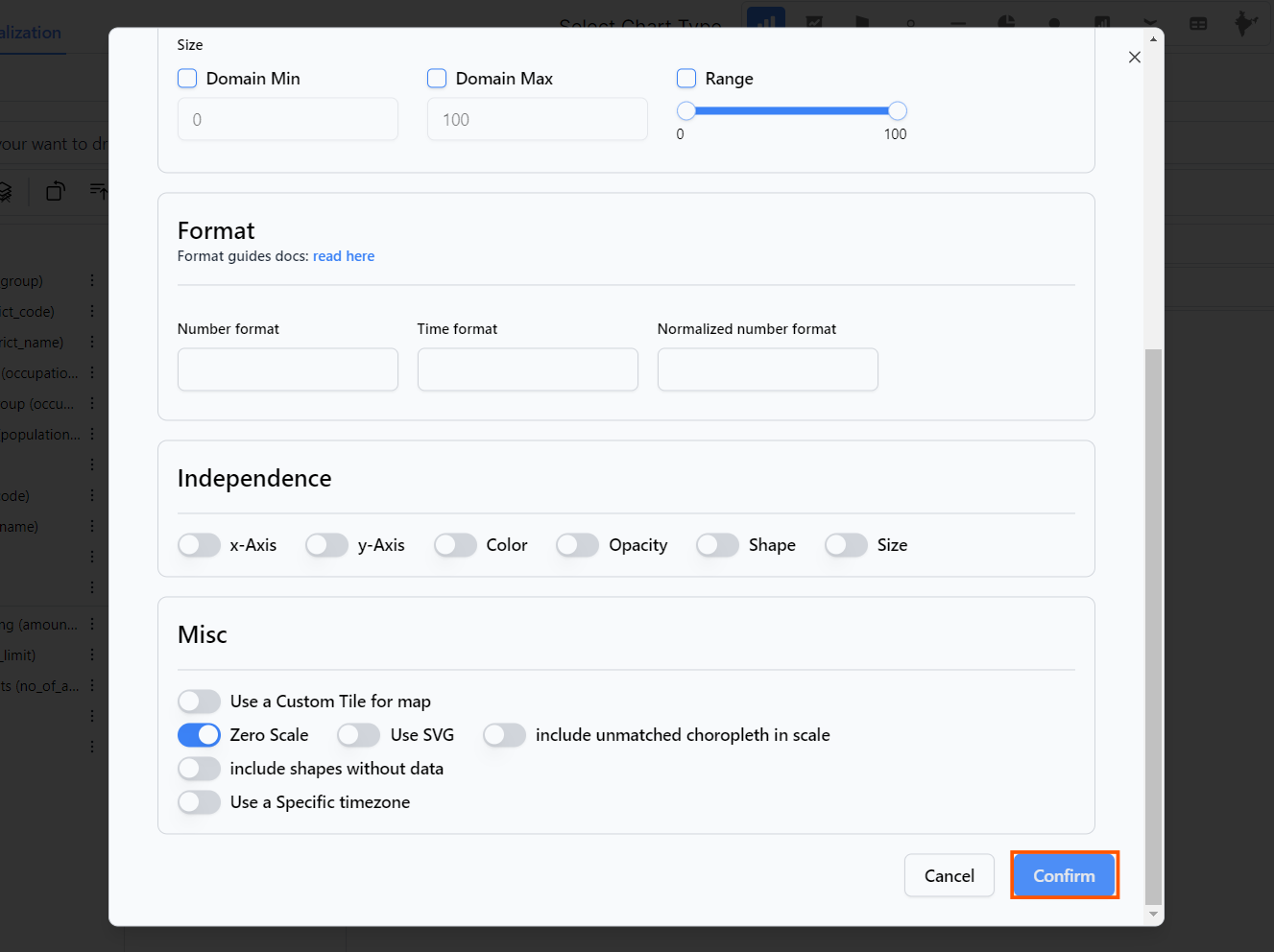
12. Click on Confirm
13. You can also adjust the layout mode.
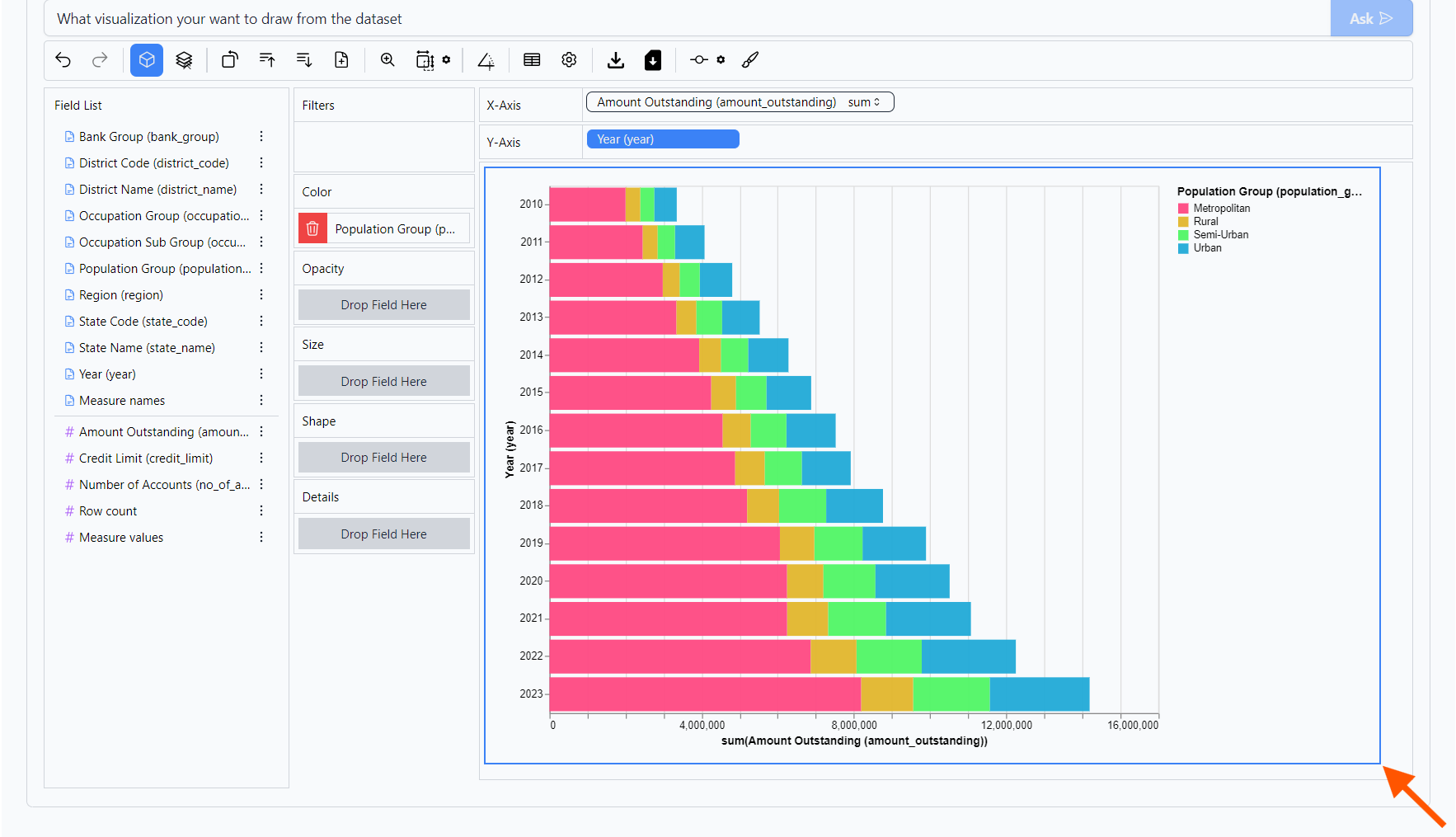
14. Drag highlighted element
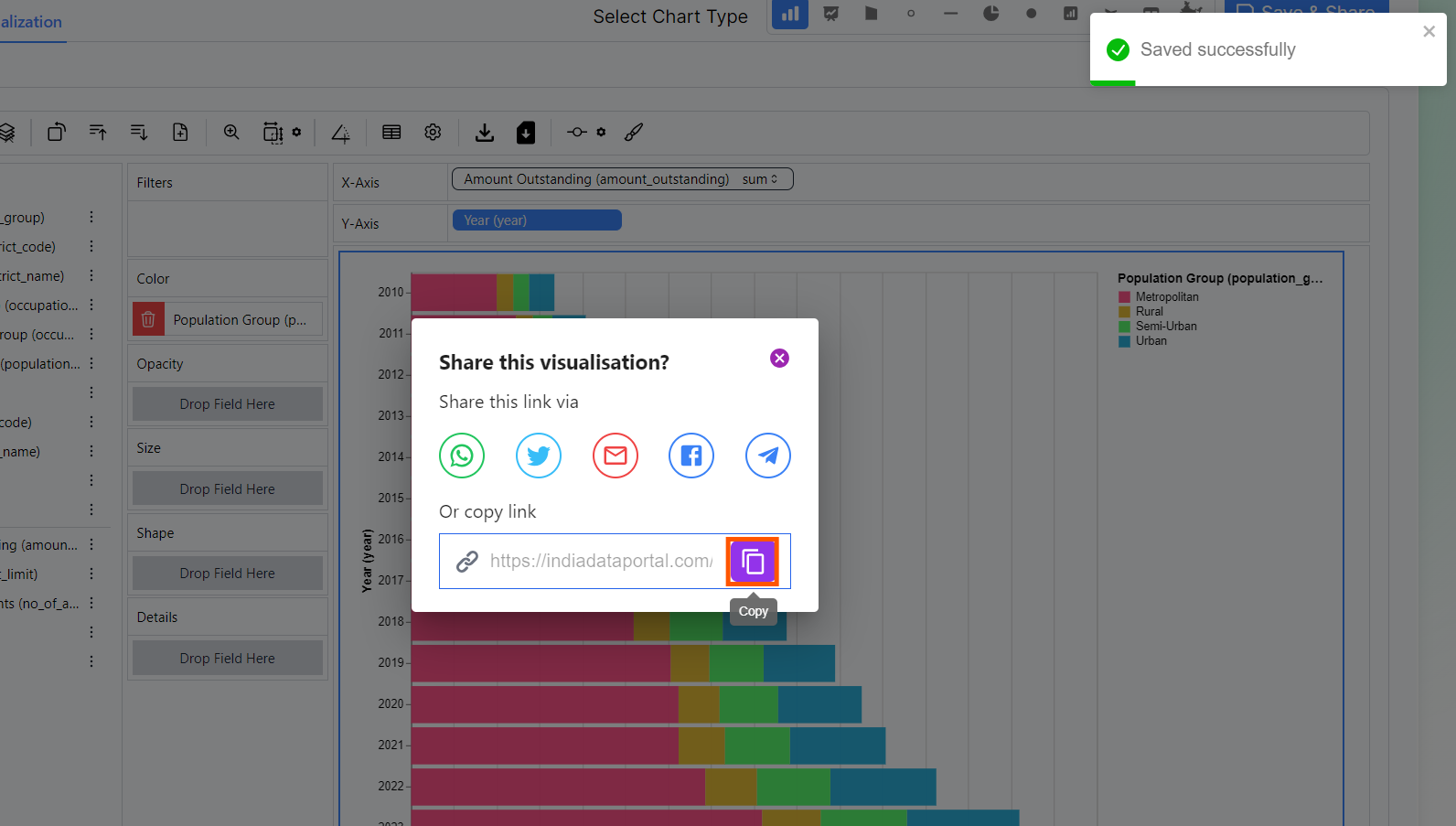
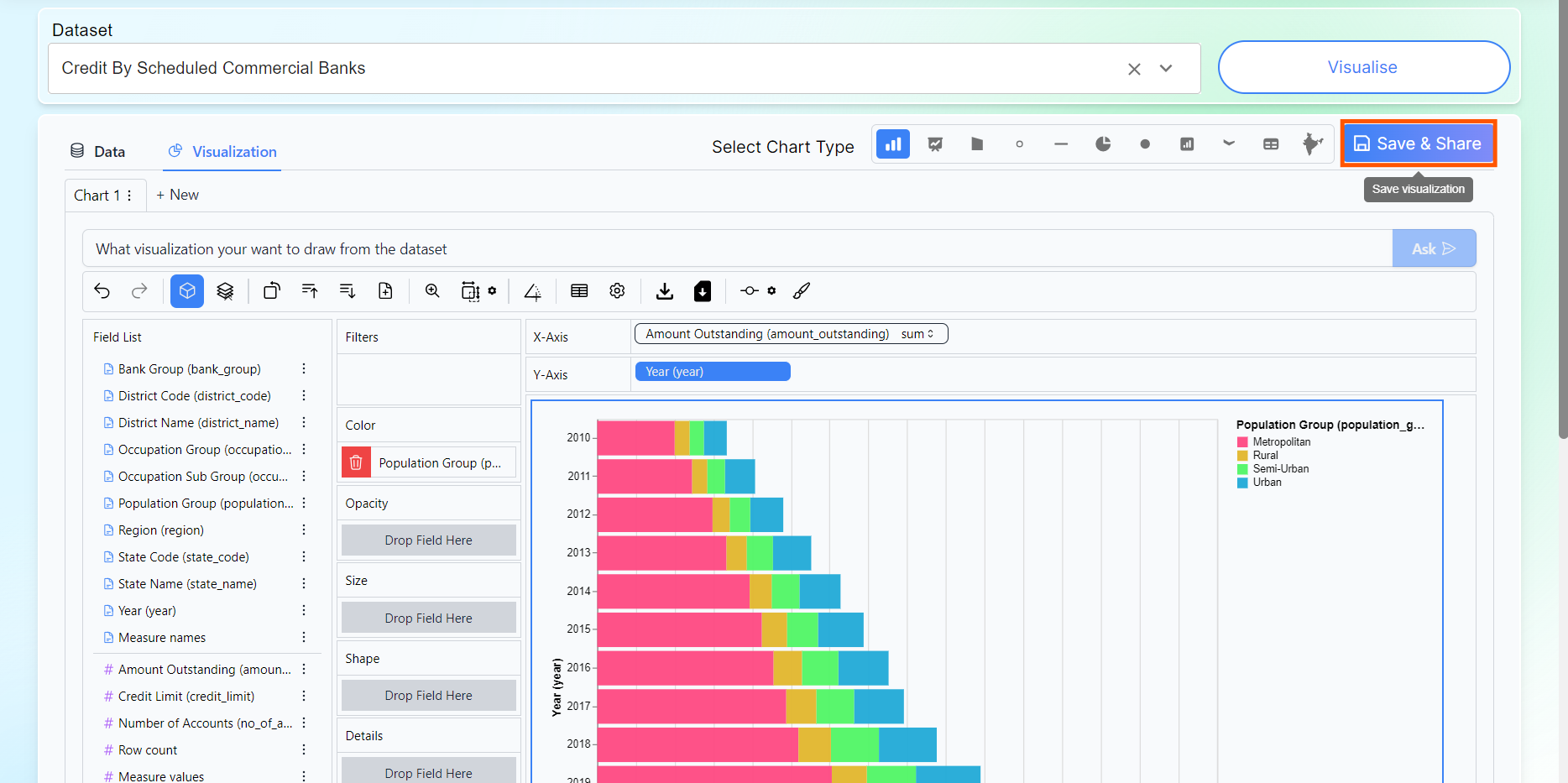
15. Click on Save & Share button to save the visualization.
16. You can click on copy icon to share this visualization.